Good design leaves room to breathe
What empty space can teach us about making things that feel human.

5 min read

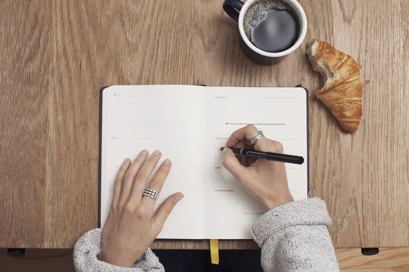
Walk into a well-proportioned room and you might feel comfortable before you can explain why. A chair gives you a place to sit. A window gives your eyes somewhere to go. The space between them lets both things do their work.
That space is not a failure to finish the room. It is part of the design. The same is true of a page, a conversation, or an afternoon with fewer appointments than it could possibly contain.
Space is a relationship
Designers sometimes describe empty space as if it were an ingredient to sprinkle over a finished composition. Add a wider margin. Increase the line height. Remove a border. Each of those decisions can help, but space works best when it expresses a relationship.
Two related things belong close enough to read together. A new idea needs enough distance to make its arrival clear. A primary action needs a little quiet around it. When those relationships are coherent, a design asks less of the person using it.
This does not make simplicity the answer to every problem. A crowded market can be beautiful; a dense newspaper can be useful. The question is whether a place offers a way through its complexity. A little hierarchy can be more generous than a great deal of blankness.
Make a place for the reader
One of my favorite design exercises is to remove a single element and ask what changed. Does the page lose meaning, or only weight? Did the label clarify something, or repeat it? Did the decoration create a mood, or merely fill a space that made us nervous?
There is no universal amount of breathing room. A poem and a train timetable need different kinds. The useful habit is to recognize that the person on the other side of the design arrives with their own attention, context, and expectations.
Leave them somewhere to stand. Give their eyes a place to rest. Sometimes a design feels finished precisely when it stops trying to occupy every available inch.